Category design

Read about the posts of category design

As a UX consultant, I always think about what is better a regular menu or a hamburger menu. In mobile version obviously but in desktop?

Let me explain the pros and cons:

The hamburger menu is an actual navigation element you can find on sites, landings, webs, apps, and programs. It’s a design of three horizontal lines. Is an icon and a button that typically opens a sider menu or navigation.

Created by Norm Cox almost 40 years ago!

This is the hamburger menu: bread, hamburger and bread.  So, that’s why the name.

Hamburger menu


Let me share my thoughts:


PROS: This is a list of why use the hamburger menu:


  1. It’s SIMPLE and very clean.
    It’s easy to access the navigational menu.
  2. It’s recognizable for users. People know that in a hamburger menu there is a navigational menu, so we are used to.
  3. It’s the other access. If you have a menu or other navigational items, the hamburger helps to add a new one.
  4. It uses for a mobile version.


CONS: This are a list of why NOT use the hamburger menu:

  1. Hidden navigation
  2. Make pages less important  and less effective
  3. Low engagement: the click rates go down and down…
  4. Two clicks is an extra step to get to the goal. To achieve the content you click twice.
  5. Not for a desktop version.

So, here my  recommendations,  as Nielsen Norman Group:

Hamburger menu Recommendations:


Desktop:

  • Do not use in desktop user interfaces

Mobile:

  • Use it if you have more than 4 level navigation links.
  • Provide footer with page links to important information on your site

A picture speaks a thousand words.

An image of SEO must speak. In my last three works, I made different consultancies for customers and I detected the same issue: the images.

How is this part important, images are important as relevant keywords. Nowadays we use more images and media to improve our websites. So this kind of content needs to be review and optimize.

The images are always forgotten. And Google likes images and users also.


Let’s start with a list of best practices to keep in mind.

3 Basics Tips SEO Images:


1. Name of images.

When we create a website we take care of the name of images. We always find projects with Incredibles names or numbers to images. I found images like DSC30303 or Screenshot22.01.2009 or Prueba. The name is so important because Google read the archive and the name of our image.
The images need to BE descriptive. Yes Descriptive, it’s mean the name must represent what we see.
It’s important to add relevant keywords also. If we review analytics we could see how customers search us and use the image naming process.

As Google says the Filename give clues about what is the image.

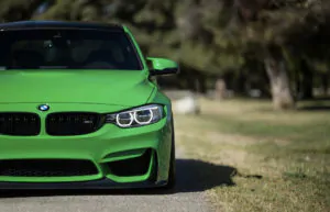
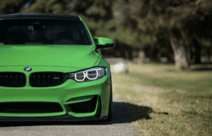
Example if the image is a green car:

Green car on the road

<img src=”https://exampleweb.com/images/green-car.jpg”>


Also if you have a brand you could ad your brand on the image like green-car-ebavs.jpg.

2. File size

I discovered 3GB for a Background image or images of 1Gb.

Bear in mind:

  • Consumers do not like to wait unless on mobile.
  • Google uses page load time as a factor in their algorithm. And now with the new Core Vitals, this is so important.

So review the file sizes, compress the images and optimize them. There are a lot of articles to do it:


Image optimization

Yoast SEO images optimization

The formats are relevant  also use :

  • GIF, lower quality than JPEGS used for icons, transparency, animations.

    Green car on the road

    Gif – 317Kb

  • PNG, the alternative to GIFS, allow transparency more colours. But the sizes are bigger than JPG. PNG is better used on flat and colours images.

    Green car on the road

    PNG – 606kb

  • JPG: able to compress images considerably, could have nice quality and low file size. Not transparency is allowed.
    Green car on the road

    Jpg – 290Kb


  • And more with Guidelines Google images

3. Alt attribute
The alt attribute (text that describes an image) is the alternative text is used to:- highlight the identity of an image

  • appears when browsers have problems rendering
  • read by screen readers to help visually issues: improves accessibility for people not see images on the website
  • read by search engines
  • Google uses the alt text on the algorithm to understand the content of the website

That’s a normal code that I discovered:

<img src=”https://exampleweb.com/images/green-car.jpg”>

That’s a good code:

<img src=https://exampleweb.com/images/green-car.jpg alt=”A green car on the road”>

The alt attribute is also a descriptive text for the image, normally we use 8 words.


These are 3 basics tips to follow on your sites. Are very easy and common sense tips.


If you want to know more about SEO, we do Workshops and we are experts on it.

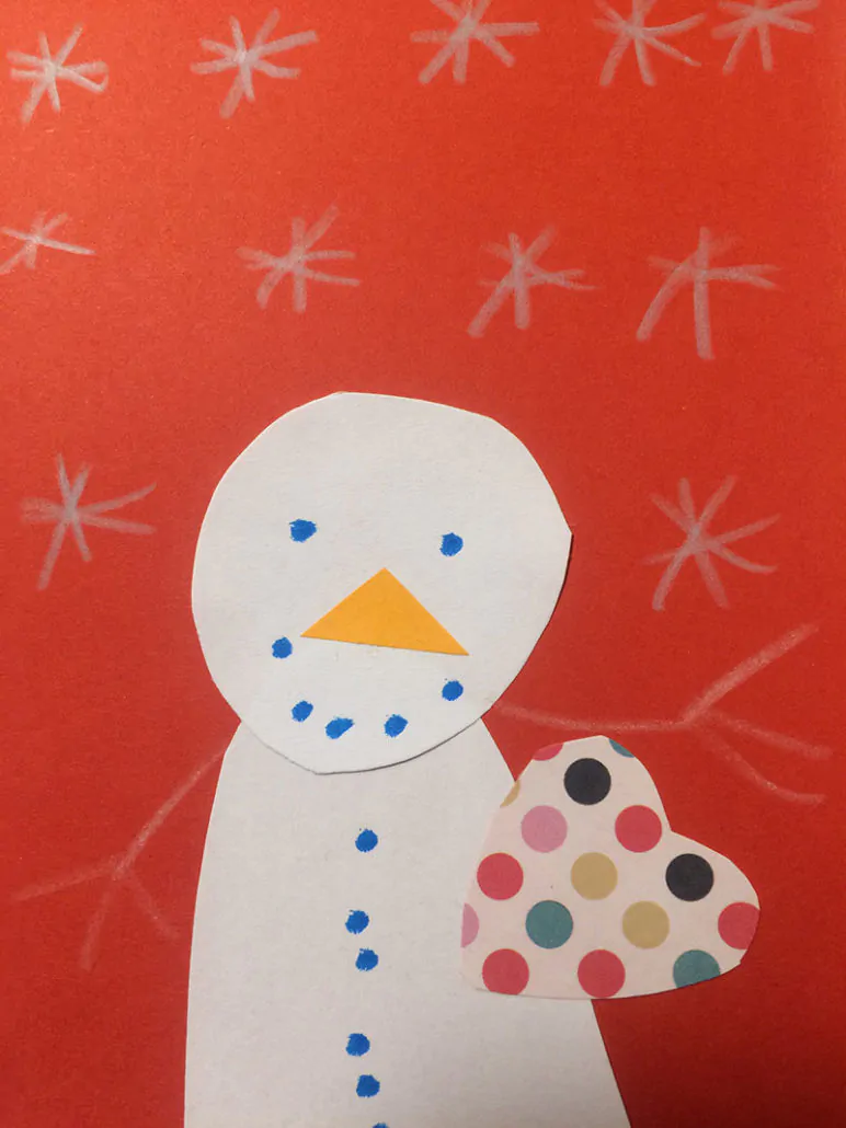
In 2016, we created in EBAVS / our Christmas postcard to wish Happy Holidays.
A familiar DIY with:

  • Red card
  • Love
  • White paper
  • 6 years Old Daughter
  • Orange paper
  • Cryings
  • White pencil
  • Scissors
  • Smiles
  • Dotted Paper
  • Shouts
  • Glue
  • 10 Months baby boy
  • Blue marker
  • Patience
  • Effort

Happy Holidays to all with a REAL XMAS POSTCARD!

postal-nadal-ebavs


The lasts years we did a Christmas action: The pooping log, or a cake

Tió or The pooping log is a Catalan tradition, typical of Christmas.

It’s a log, for the first time is a relation with fire and connected nature, protection, fertility and winter solstice. It’s very scatological because we feed the log with food like nuts, cookies, fruits and the log eat magically; then on Christmas Eve, we beat and yell it, singing: “Caga tió, ametlles i torró, no caguis arangades que són massa salades, caga torrons que són més bons.
Caga tió, ametlles i torró, si no vols cagar et donaré un cop de bastó


Caga tió!”
And then the log, covered with a blanket, make poo; obviously is not real, the poo are gifts for kids or family. We love our scatological traditions, we use to do it, because we have a little girl of 5 years old in the house, and we are expecting a little boy, so we are experts on it.

So we start thinking about a creative idea to make a Christmas action. The objectives are to make something GOOD, something that brings a smile to our faces, so we thought that the best way is sharing:

  • The Catalan tradition of Tió
  • Something good and do something good (objective 1000 shares or link to the good deed)
  • Our job: creative, illustration, development and marketing

From that idea, we create an action, started the 8th December – date Tió arrives at the house – to Christmas Eve.

Then, we create the log with kawaii style, and also a landing page to explain all our idea.

The idea consists of feeding every day the poopinglog to see the poo. The poo is a share in Facebook or Twitter with an image (more than 100 ) + phrase + URL to promote a good thing with the #thepoopinlog.

But what kind of share?

The share or poo is something good, so we make research of good things like caring, giving, helping, researching, supporting and sharing; and make happy these organizations, ONG’s, foundations, etc…

And also, we beef up #thepoopinglog, creating a digital strategy based on 3 social profiles:

  • Facebook page
  • Twitter profile
  • Instagram
  • E-mail marketing


Finally, here it is, our new site in 2015: ebavs.net.
A few months ago, Victor and I thought to refresh the site, and now we are happy to present our little kiddo.

We are very tough with us, so we wanted a new site, but with specific requirements: responsive, clear, fast, SEO friendly, in English, beautiful, simple, user-friendly, extended portfolio, products, review blog, etc..
We developed like 3 or 4 versions.. and at least we chose the one we relaunched the last week.

We divided the site into simple architecture information – as we said we need to be clear and simple – :

  • WE: Who we are, what we do, our mission, why choose us. We also used pictures of our TV interview at TV3 Cites – minute 12:00 – and linked to our social media profiles.
  • SERVICES: What we do, we make with love, because we love our job. Our services are CTO, DIGITAL PROJECT MANAGEMENT, CUSTOM DEVELOPMENT, WEB DEVELOPMENT, WP DEVELOPMENT, E-COMMERCE, WEB DESIGN, UX, DIGITAL MARKETING.
  • PORTFOLIO: We choose a selection of our works and products: B-wom, Doubleyou, Optretina, BBDO, Nice Mondays, Beter, Factusol plugin, Moodle connector, etc…
  • CONTACT: A form to contact with us


So, welcome the new site and long live ebavs.net!

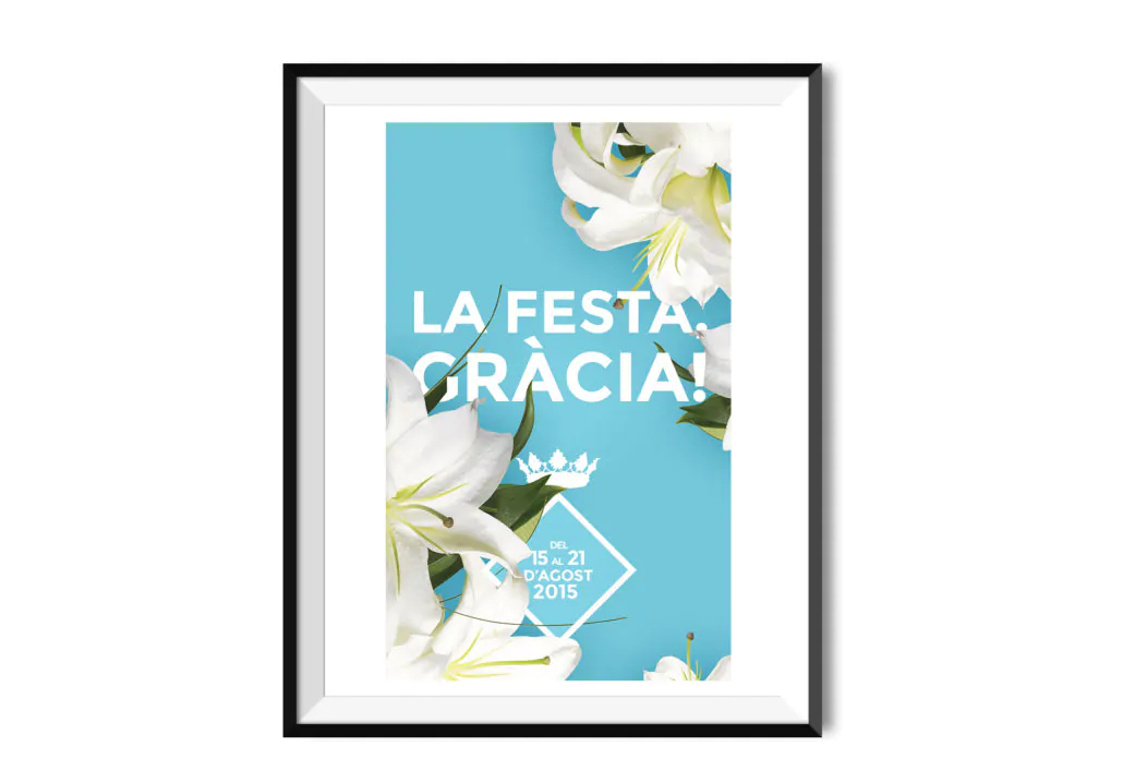
Again, as last year: finalist at Cartell Gràcia 2014 we are a finalist at Cartell de Gràcia 2015.
We are very proud to participate and again ranked among the 30 best 160 posters.
We are in an exhibition until August 2015 at  Alzina street nº9, Barcelona, with our tribute to the shield Gràcia.
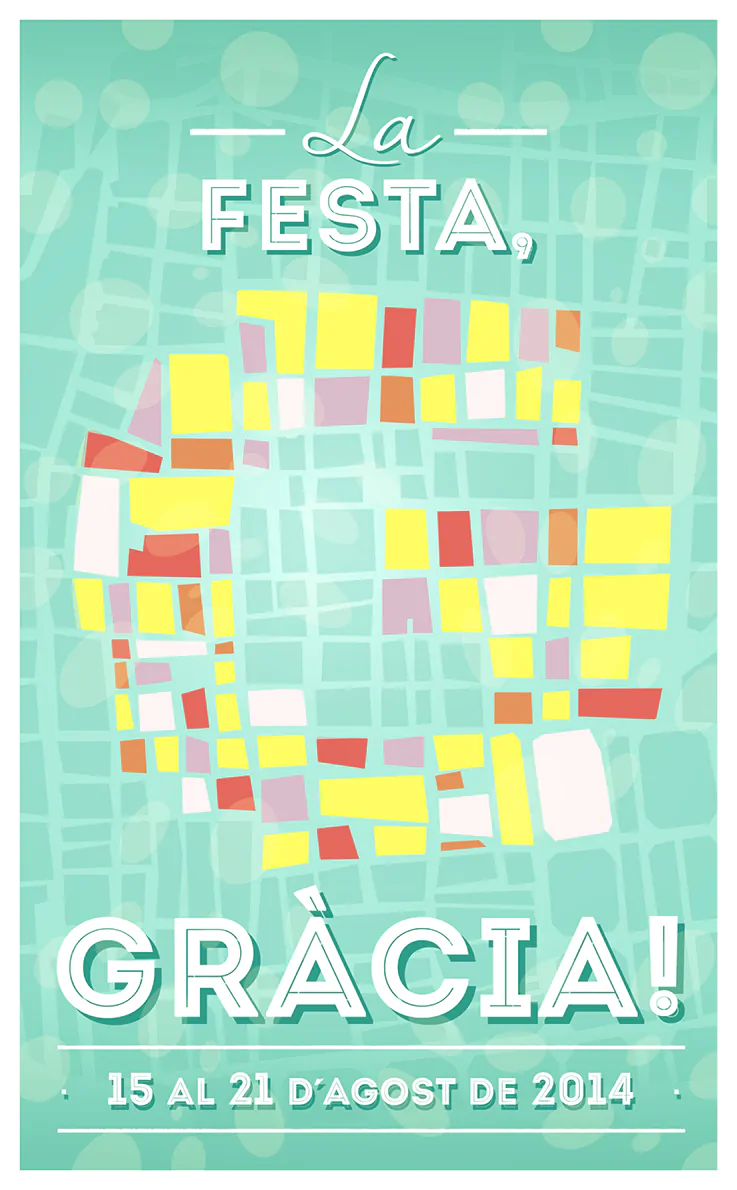
We live in Barcelona and work in Gracia. This district has a popular festival called La Festa Major de Gràcia. The streets make a competition of ornaments on the street. Also, there is a pitch for a poster to illustrate it.
 In  2014  we are poster finalist with our G map, and in 2015 again with a tribute to the flag of Gracia.

clients-ebavs-cartellgracia2015

In 2008 I created a friend a little design studio called CLARISSIM, we started to participate in all posters competitions in Barcelona. We became experts on that, and both won awards. Clara won the award for best poster of them Fiestas de Gràcia, and I won the poster Fiestas del Guinardó.

Since then, the solution of Clarissim and multiples works, in 2014, I created again.
I participated again in a poster to the Festes de Gràcia and become a finalist with my map of Les Festes de Gràcia.
festa-major-gracia2014

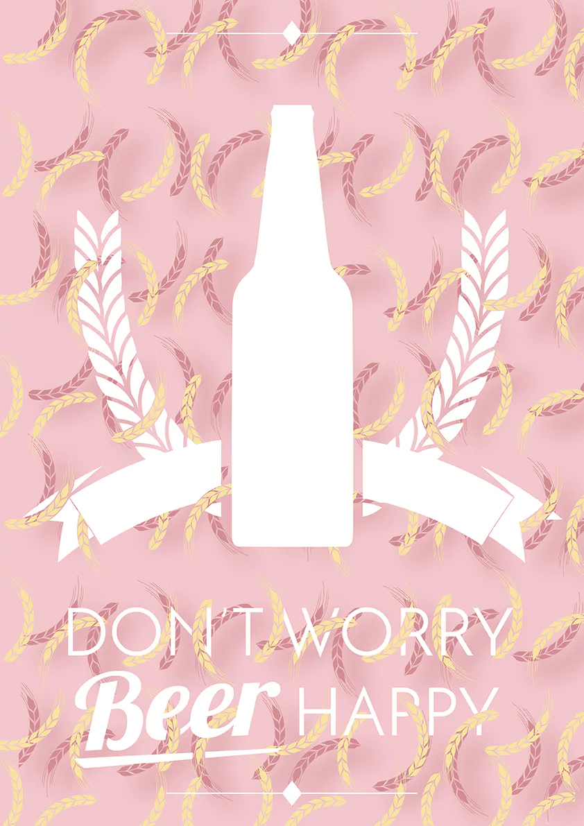
Also, Betahaus, and who took part in the interior of the bar-brewery, offered me to participate in the #thebeerproject.
Create something with environment beer and take part in an artist’s exhibition, so I decided to participate.

I used colours that contrast with the typical image of beer (brown, red, yellow). I used the branch as a graphics resource barely forming the background pattern. I wanted a positive message, more feminine. And this was my result. Where branches are intertwined with the message.

the-beer-project

On Thursday, January 23, at 19:30 was the opening of the exhibition “The Beer Project” open until the end of April in the new bar/brewery
[Garage Beer Co]